What Two Participant Profiles Found Setting Up Cal.com
27 March 2026
Cal.com is open-source scheduling infrastructure used by thousands of teams. The product is mature, well-regarded, and has a generous free tier. We wanted to test something different from a landing page evaluation — what happens when participant profiles actually try to use a product?
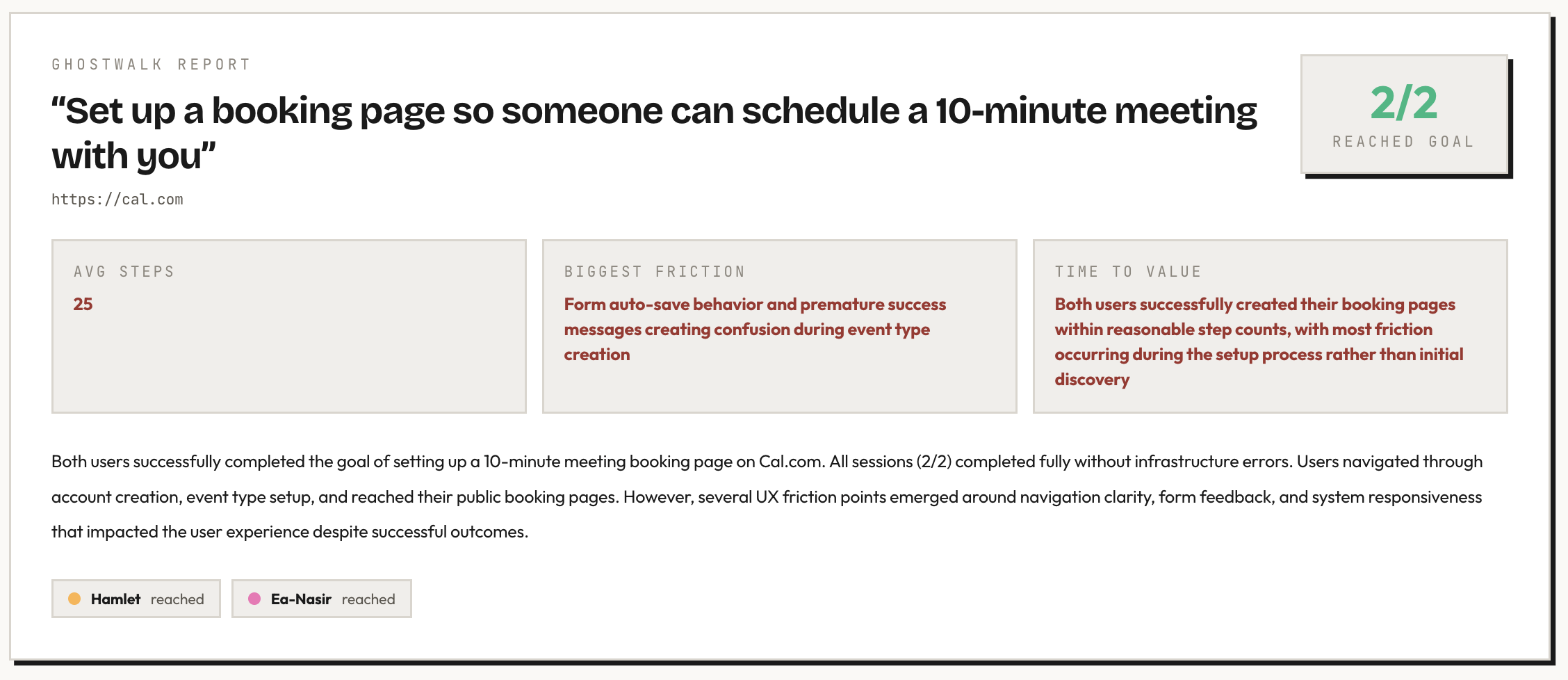
We gave two Ghostwalk participant profiles login credentials for a Cal.com account and a specific task: set up a booking page so someone can schedule a 10-minute meeting with you.
The participant profiles
Hamlet — a guidance-seeking newcomer with low domain familiarity. Confused by jargon, patient, and careful about what to click next.
Ea-Nasir — an evidence-seeking buyer comparing alternatives. Price-sensitive, review-oriented, and unwilling to commit without understanding the tradeoff.
What worked
The free tier is genuinely generous. Ea-Nasir — who goes to pricing before doing anything else — spent five steps reviewing the feature comparison and couldn't find a meaningful limitation for his use case. Custom durations, calendar sync, timezone detection, cancellation, rescheduling — all free. No cap on event types.
The event type concept is immediately clear. Both participant profiles landed on the Event Types page after login and understood what to do. "Configure different events for people to book on your calendar" — Hamlet read this and knew exactly where he was.
Default settings are sensible. Both participant profiles checked Availability and found Monday–Friday working hours with auto-detected timezone. Hamlet: "This seems like a reasonable default." Good defaults mean fewer decisions for new users.
Login flow is smooth. Both participant profiles signed in with email and password on the first attempt. No friction, no confusion.
What the participant profiles found
Pricing page looks identical to the homepage
Ea-Nasir clicked "Pricing" in the top nav and the URL changed to /pricing, but the page looked identical to the homepage. He had to scroll down past feature descriptions to find actual prices buried in a "Feature breakdown" section.
"My click on 'Pricing' seems to have just reloaded the same page or brought me to cal.com/pricing but it looks identical to the homepage. That's annoying. I am still on a page titled 'The better way to schedule your meetings' and I don't see any pricing tables."
The prices are there — Individual (Free), Teams ($12/user/mo), Organizations ($28/user/mo) — but a user clicking "Pricing" expects to see prices, not more marketing copy.
Auto-save fires before the form is complete
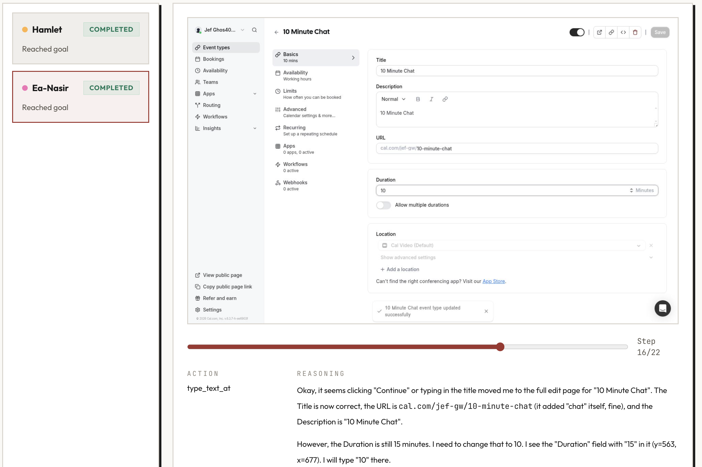
Both participant profiles experienced this. They'd start filling in the new event type form — type a title — and the system would auto-save and navigate before they'd finished filling in other fields like duration and description.
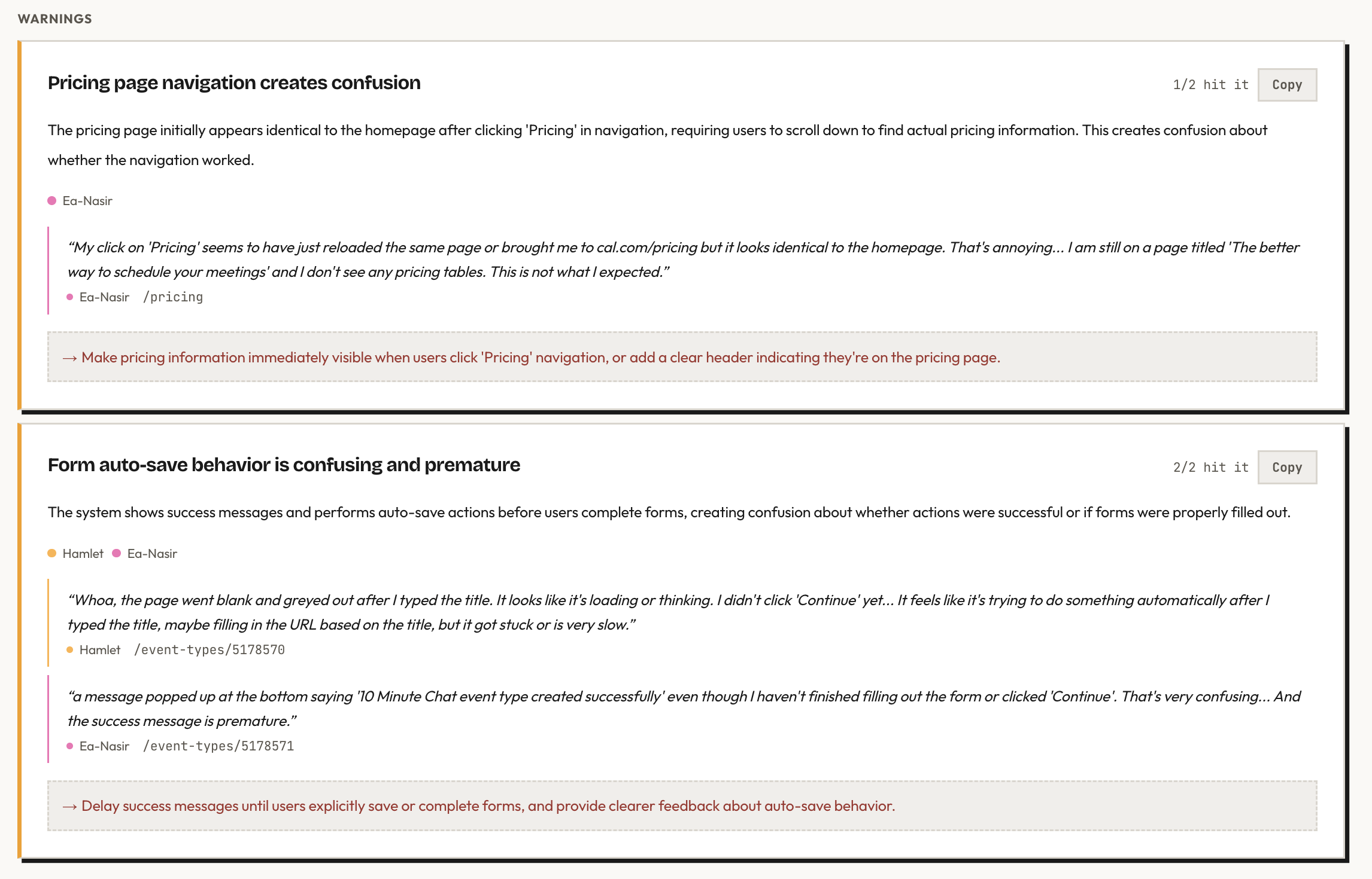
Hamlet: "The page went blank and greyed out after I typed the title. I didn't click 'Continue' yet." Ea-Nasir: "A message popped up saying '10 Minute Chat event type created successfully' even though I haven't finished filling out the form or clicked 'Continue'. That's very confusing."
The event type gets created with default values before the user has a chance to customize it. It works — but the premature success message and page transition make the user feel like they lost control.
Availability navigation is confusing
Both participant profiles clicked "Availability" in the left sidebar expecting the main content area to change. It didn't — they'd clicked the top-level nav item, not the in-page section link. Both had to try again to find the right click target.
A small detail, but both participant profiles hit it independently, which suggests the dual navigation pattern (sidebar nav vs. in-page section tabs) creates genuine confusion.
Where participant profiles spent their time
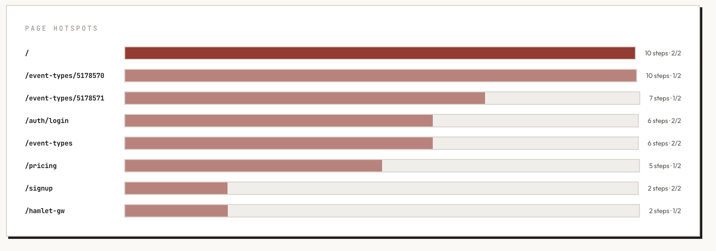
The homepage consumed the most steps (10 steps, both participant profiles) — mostly scrolling through marketing content before finding the sign-up flow. The event type editor was the second hotspot, which is expected since that's where the actual task lives. Login took 6 steps for both, and pricing took 5 steps for Ea-Nasir alone.
What this tells you
Cal.com's product is solid once you're inside it. The event type system is intuitive, the defaults are thoughtful, and the free tier is genuinely competitive. Both participant profiles completed the task and verified their public booking pages were live.
The friction lives in the margins: a pricing page that doesn't immediately show prices, auto-save behavior that fires too early, and navigation patterns that require a second click to find the right target. None of these are dealbreakers — but they're the kind of small friction points that compound into a "this feels a bit off" impression for new users.
These are exactly the findings that are invisible to the team building the product (they know where the pricing is, they expect the auto-save) but immediately obvious to someone using it for the first time.
Run details
- URL tested: cal.com
- Participant profiles: Hamlet (guidance-seeking newcomer), Ea-Nasir (evidence-seeking buyer)
- Goal: Set up a booking page so someone can schedule a 10-minute meeting with you
- Steps: 28 (Hamlet), 22 (Ea-Nasir)
- Goal reached: 2/2
Run the same kind of pre-launch check on your own product. Your first study is free.