What Three Participant Profiles Found on Cursor's Website
27 March 2026
Cursor is one of the most talked-about developer tools right now. The site is polished, the product is real, and the company logos in the hero section include Stripe, OpenAI, and NVIDIA. If any landing page should hold up to scrutiny, it's this one.
We pointed three Ghostwalk participant profiles at cursor.com with a simple goal: understand what this product does, who it's for, and whether the pricing makes sense. No credentials, no onboarding — just the marketing site.
The participant profiles
Jep — an indie hacker. Technical, entrepreneurial, price-sensitive. Goes to pricing first, evaluates everything through the lens of "is this worth my money."
B. Yaga — a risk-aware evaluator with a high trust threshold. Reads everything, notices detail, and checks the fine print before committing.
Mark — a time-pressed founder screening for immediate value. Technical, skims content, and expects the signal to be obvious fast.
What worked
The value proposition landed immediately. All three participant profiles understood what Cursor does within the first two steps. "Built to make you extraordinarily productive, Cursor is the best way to code with AI" — clear, specific, no jargon. Nobody had to click around to figure out what the product was.
The top navigation is clean and effective. Jep went straight to Pricing. Mark went to Product. Both found what they wanted on the first click. The Product sub-menu — Agents, Code Review, Cloud, Tab, CLI, Marketplace — gave a structured overview of the product's capabilities without overwhelming.
Trust signals work. Jep and B. Yaga both noticed the company logos and referenced them in their reasoning. For a careful evaluator, seeing recognized names builds confidence before reading the features.
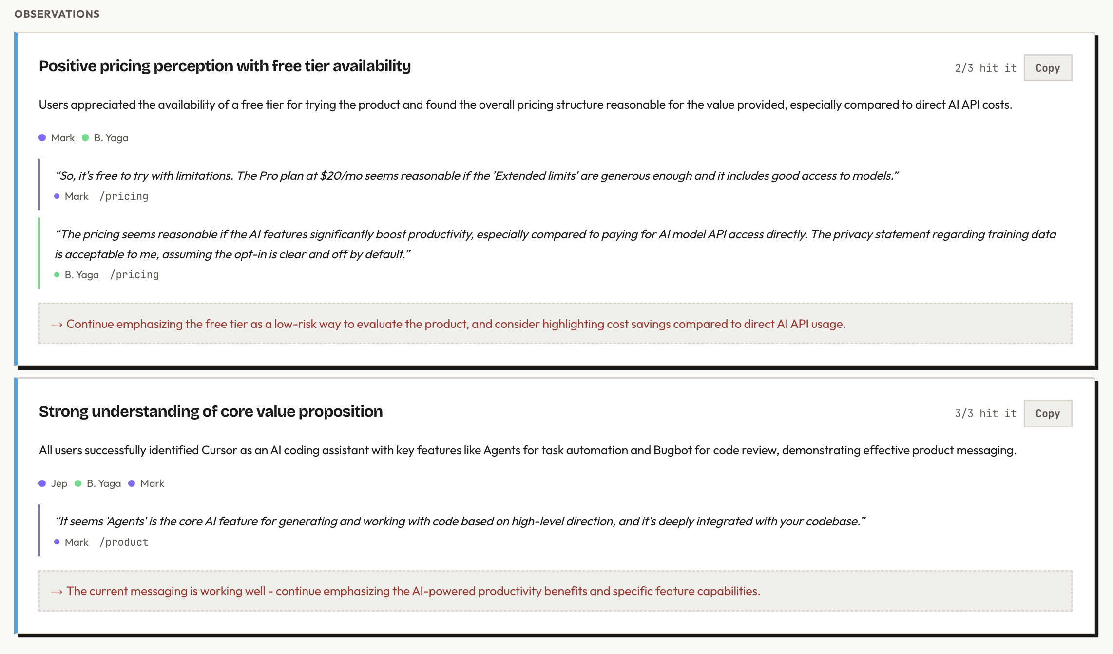
The free tier is reassuring. The Hobby plan — free, no credit card — reduces the barrier to trying the product. Mark's reaction: "The Pro plan at $20/mo seems reasonable if the 'Extended limits' are generous enough." B. Yaga compared the value favorably to paying for AI model API access directly.
The privacy story is strong. B. Yaga located the privacy policy and found the key clause: Cursor does not use your code to train their models unless you explicitly opt in. For a tool that interacts with your codebase, this is exactly the reassurance a careful user needs.
What the participant profiles found
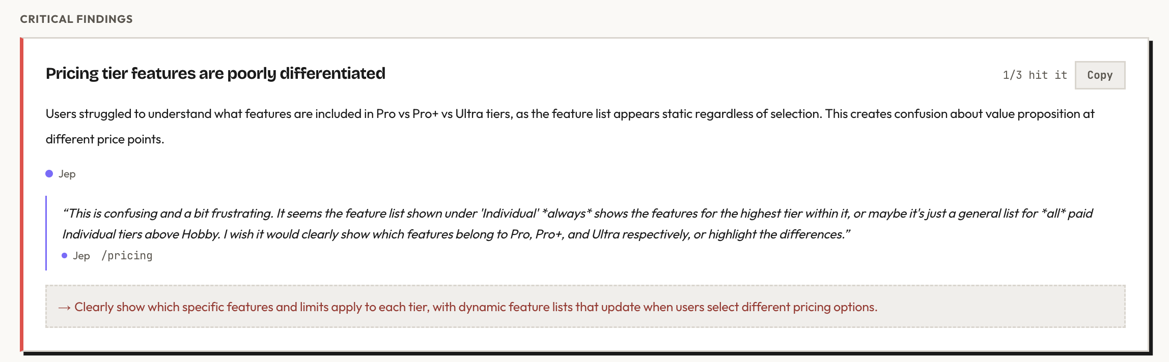
Pricing tiers are hard to tell apart
This was the strongest finding. Jep explored all three paid Individual tiers — Pro, Pro+, and Ultra — and found that the feature list shown on the page doesn't change between them.
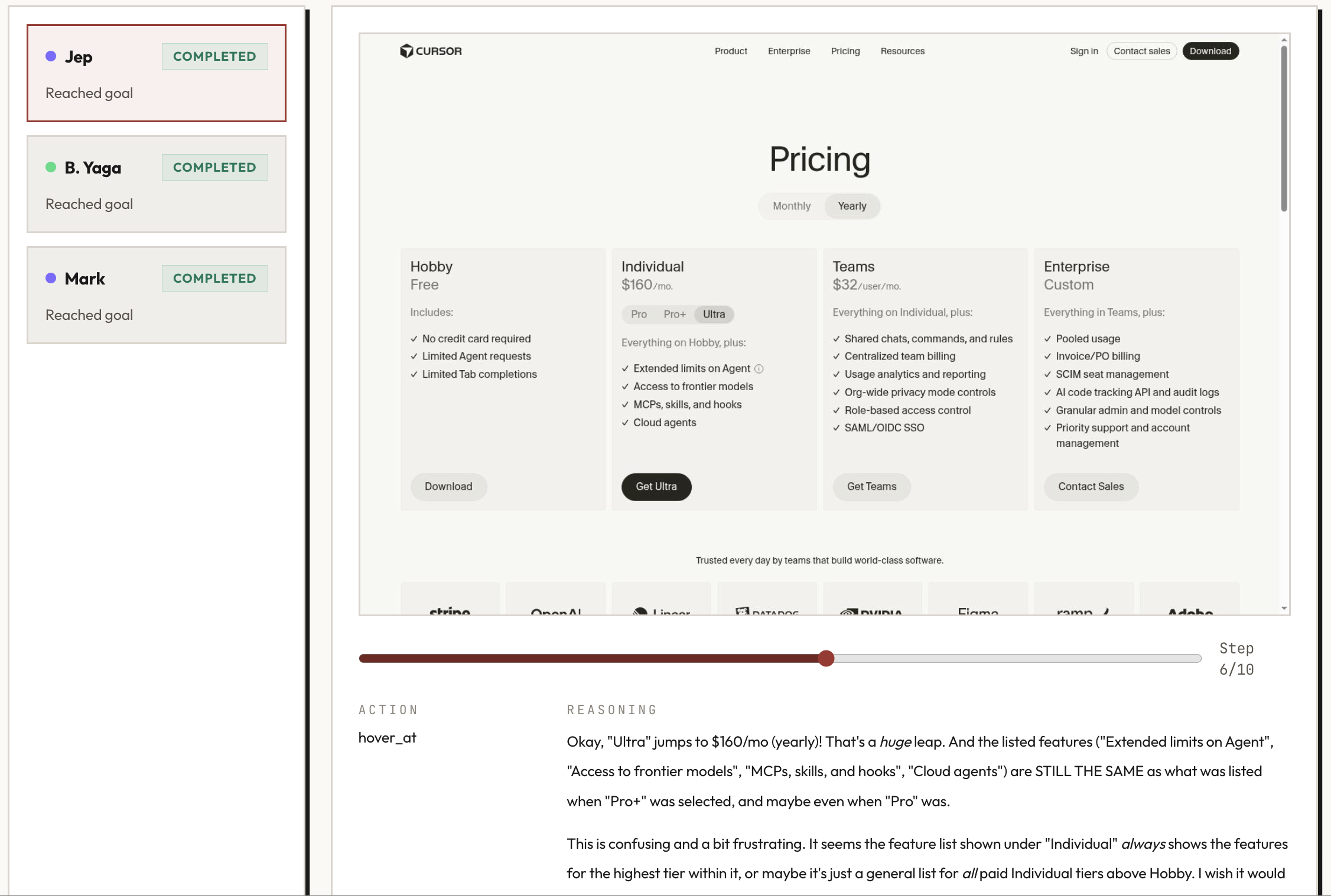
The actual difference between tiers is usage limits on AI models (1x, 3x, 20x), but this isn't visually clear. The feature list looks identical for all three, and there's no comparison table or highlight showing what changes. A user evaluating pricing has to infer the difference from small text rather than seeing it at a glance.
Clicking "Cloud" takes you to a login page
Both Jep and B. Yaga clicked "Cloud" in the Product sub-menu expecting to learn about the feature. Instead, they were redirected to a login page. Every other item in the Product sub-menu leads to an informational page. Cloud is the exception, and the redirect is jarring for someone still in evaluation mode.
The info tooltip doesn't respond
Jep noticed a small 'i' icon next to "Extended limits on Agent" on the pricing page — the kind of element you'd expect to reveal more detail on hover. He tried hovering over it. Nothing happened. For a pricing page where the tier differences are already unclear, a non-functional tooltip is a missed opportunity.
A link in the privacy policy may be broken
The privacy policy references a "Privacy Overview" for details on how training data is handled. B. Yaga clicked the link. It didn't navigate anywhere.
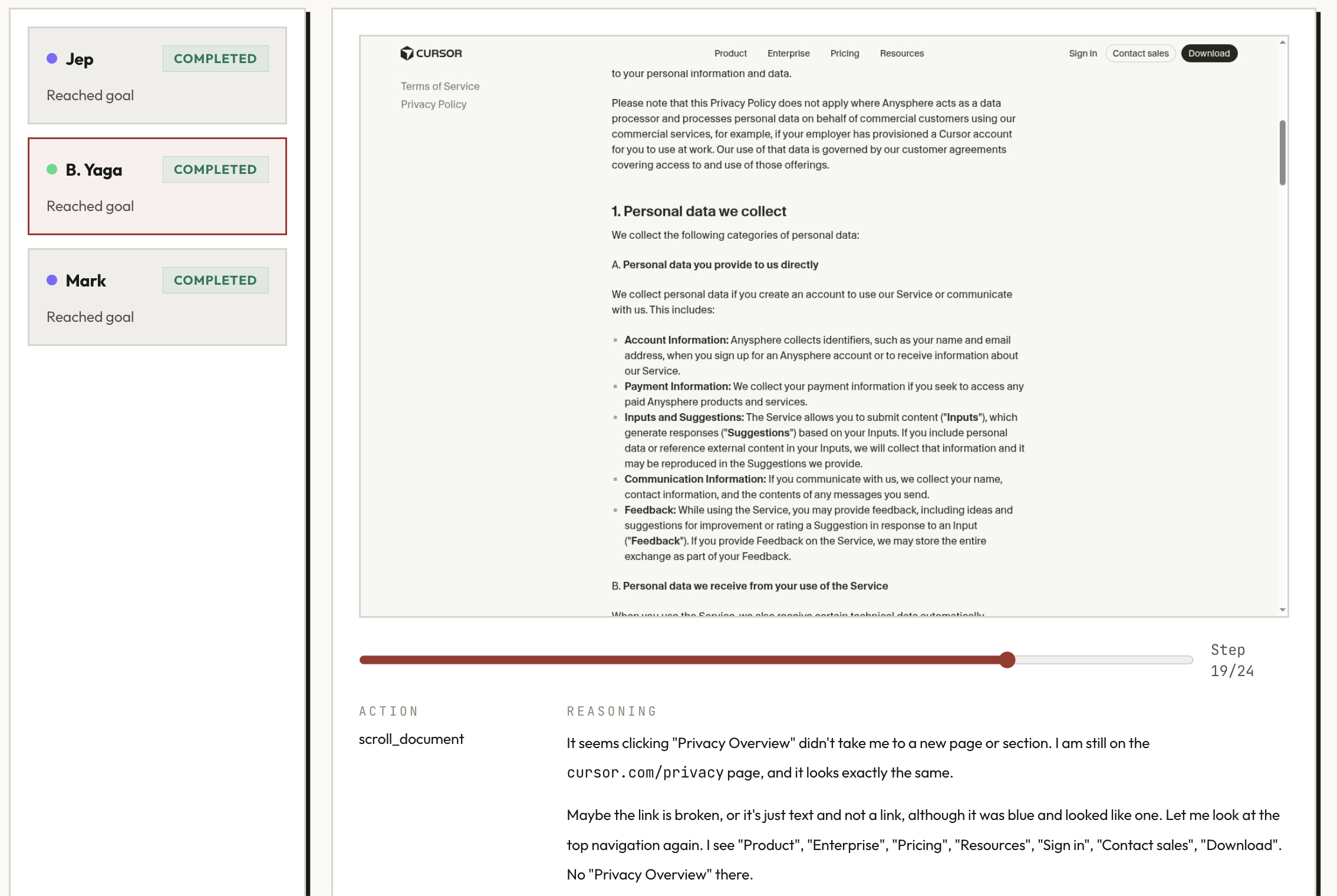
The information she was looking for did exist further down in the same document — but the broken link sent her searching for it elsewhere first.
What this tells you
Cursor's homepage does a lot right. The messaging is clear, the navigation is intuitive, and the trust signals are well-placed. A first-time visitor understands the product within seconds.
The friction is concentrated on the pricing page — where the stakes are highest. A user who's already convinced by the product lands on pricing ready to decide, and then can't tell what they're paying for at each tier. That's the moment where clarity matters most, and it's the moment where Cursor's site is weakest.
None of these findings required deep technical testing. They required someone seeing the site with fresh eyes — which is exactly the point.
Run details
- URL tested: cursor.com
- Participant profiles: Jep (indie hacker), B. Yaga (risk-aware evaluator), Mark (time-pressed founder)
- Goal: Understand what this product does, who it's for, and whether the pricing makes sense
- Steps: 10 (Jep), 24 (B. Yaga), 11 (Mark)
- Goal reached: 3/3
Run the same kind of pre-launch check on your own product. Your first study is free.